

Project #2
Colored pencils - realism
INQUIRY STATEMENT
How can layering, color blending, and composition choices transform an everyday object into a compelling and realistic work of art?
By layering colored pencils, you can build up depth and rich tones that make flat colors look more realistic. Blending helps smooth transitions between colors, so the objects look shiny and 3D with light and shadow. Good composition also makes a big difference: arranging the pieces of an artwork at angles with overlapping shapes keeps the piece dynamic and interesting. Altogether, these techniques turn something simple into a detailed, eye-catching artwork that feels pleasing, realistic and compelling.
CONNECTION
Cultural, historical, and artistic influences with critical evaluation.
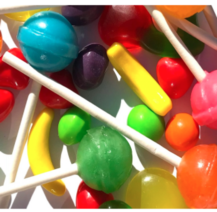
REFERENCE IMAGE 2
Final image
The reference videos helped me build essential colored pencil skills before starting my final piece. From the butterfly tutorial, I learned how to layer and blend colors smoothly to create realistic shading and texture. The second video taught me about pressure control and color transitions, which I practiced in my gummy bear and sphere practices. All of these aspects and knowledge helped me to create a more polished and 3D final piece.

REFERENCE VIDEO #1
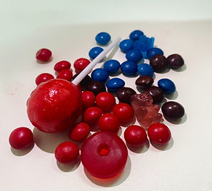
REFERENCE IMAGE
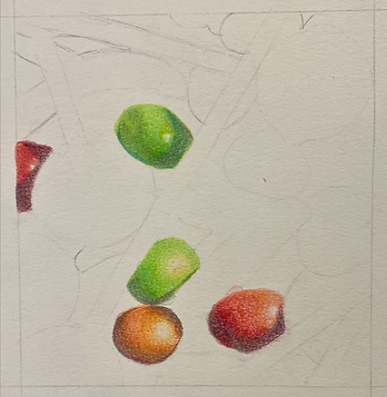
First trial

REFERENCE VIDEO #2
investigate
Visual evidence of material tests, alternate compositions, sketches.

Sphere practice
Trial 1

VALUE SCALES

Sphere practice
Trial 2

VALUE SCALES

GUMMY BEAR
PRACTICE
This piece required quite some time dedicated solely to understanding how colored pencils worked under different pressures, layers, and combinations. Many trials and practices were required to obtain a rich color that aligns with the goal in mind. As seen in the value scales, I had added various other colors to the sample tints and tones in order to enrich the final color. The value scales were very helpful in the beginning of figuring out the piece as I was able to understand better what a rich tone had layered. Near the end of the work, I had figured out pretty solidly what colors blended out well with eachother, what colors enriched the hues and what colors were necessary to tone down hues (Something very necessary in my piece as there are a lot of shadows and dark colors)
CREATE
Visual documentation of steps of creation

day 1

day 4

day 2

day 4.5
day 3

day 6
final artwork
Final artwork detailed image
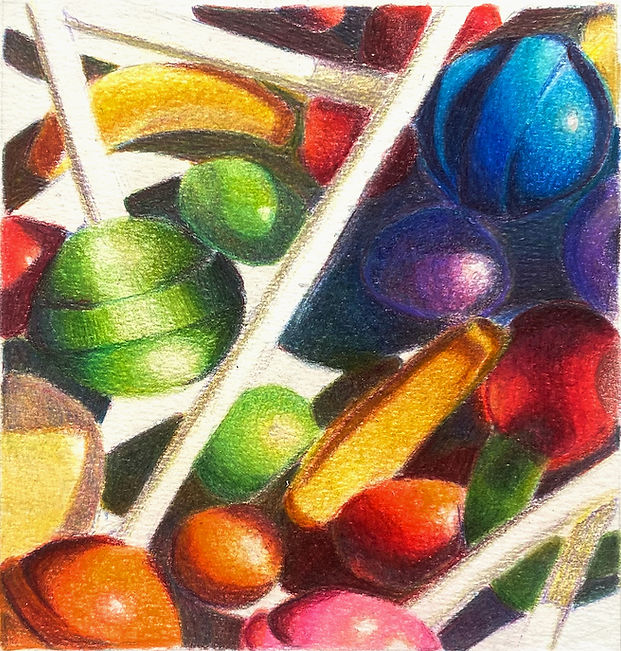
Artist: Lucía Granada
Title: Candy Chaos
SIZE: 15cm x 15cm
Date of Completion: 2 Oct 2025
The Why?: This piece was made to explore and understand the hidden beauty and proffessionalism underneath something as simple as colored pencils.
communicate and reflect
Challenges, successes, and self-evaluation of how the artwork aligns with the inquiry question.
As seen in the visual steps of creation, I changed my reference picture after the first day of work. This decision was a leap of faith on my part, as I had already lost a couple of days of work due to an overload in practices and the fact that I had spent a whole day just tracing my image. However, I feel very proud and happy with my decision. The first image I took didn't align with what I had in mind, nor what I felt like I had more experience in, which was coloring larger areas and blending colors together in bigger pieces.
Nonetheless, feel very satisfied with my final piece as I have spent a considerable amount of time just planning out what the richness of the colors, the type of burnishing I wanted to do, the effect I wanted to give, and the hidden hues beneath shadows and dark values of color. In the first days of work, I was quite scared of burning too fast the tooth of the paper, so I went in with lighter layers of the candy, and often had to recolor that area a few times after that. I feel this would have been fixed if I had given one layer of one single color to all the pieces and built the colors in the candy using that method.